
Title: what Wev'e done Size: 24 x 20 (inch) Medium: paper, ink, spray paint, watercolor, on wood board
Date of Completion: Sep. 13th, 2021
Date of Completion: Sep. 13th, 2021
|
Exhibition
~~~~~~~~~~~~~~~~ “what We’ve done” is inspired by Loui Jover, as well as two epidemics plaguing the world and society; climate change and mental health. In all my work I try to put what is important to me in it; mental health, showing a little girl by herself is how I did that this time. I showed all seasons to show climate change, and ink on paper to show my inspiration piece. The piece is called what We’ve done with an emphasis on We, because it’s about what we’ve done to the earth as well as each other. 
That day it rained Drawing
Lui Jover |
Inspiration
~~~~~~~~~~~~~~~~~~ Loui Jover is an artist I discovered on the website saatchiart.com, however he’s not solely a web-based artist. He’s a well-known artist who has participated in numerous group exhibitions as well as three solo exhibitions, and has received an advanced certificate in visual communication in 1980. He went to an undisclosed college to study commercial and graphic art. He worked as an illustrator and photographer in the Australian Army. He also had his own Graphics art business, but he ended when he realized he only wanted to produce art for the pleasure of it, not to be commissioned or limited in his artistic expression. He's been painting since he was a child, and never stopped, constantly sketching in a book or making a small cartoon. Loui Jover began his career as an oil and acrylic painter, but also worked in sculpture and collage. But it was the recycled papers from old books that really held. Jover claims that he is more motivated by Pop culture in general than by the culture wherein he lives. He states comic books and movies have influenced him. Despite the fact that he appreciates indigenous art, he believes it would be inappropriate for him to develop his own work inspired by it. I was inspired by his work with his medium decision; ink on paper. I liked the contrast between the darkness of the black, and the off white of the paper. Jover said that he didn't like using plain white paper, because “white surfaces cause me anxiety sometimes, this emptiness, the "nothing" that causes you to confront yourself; while the used, old papers already have a story on them to tell you,” and I can understand that. Plain white surfaces overwhelm me too, not knowing how to start. His work also gave me the idea of implementing rain, and a person standing in it, as well as a stand out color. |
Inspiration
~~~~~~~~~~~~~~~~~~
Another source of inspiration for me was two epidemics that have been destroying the globe and society we live in today: climate change and mental illness. I wanted to include climate change in this piece by drawing inspiration from how many people in my state, Wisconsin, claim you can witness all four seasons in two days or even one. I've had days where the temperature was 30 degrees Fahrenheit when I awoke, and by 3 p.m., it was 60 or even 70 degrees. I wanted to create a piece of art that depicted all seasons in one day. I chose dead trees to represent winter, rain to portray spring, a bird flying away to indicate fall, and birds relaxing in the branches to reflect summer.
In terms of mental health being a source of inspiration, I wanted to depict a little girl alone, reaching her hand out in front of the rain, which I would paint red, to again represent climate change. I also wanted to collect texts about mental health and climate change to utilize as background material.
|
Experimentation
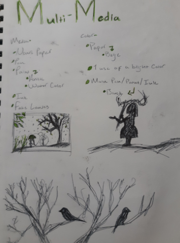
~~~~~~~~~~~~~~~~~~~~~ The first thing I did was think of the different media I wanted to use. I came up with the list of; newspaper, pen, paint (acrylic, water color), ink, and fake leaves. I knew that I wanted to use all kinds of drawing/painting utensils. I also knew that I wanted some sort of 3D aspect of it. I've always had a fascination with seeing pen on watercolor, and I knew that if all else fails, that I would at least have pen/ink over watercolor. I came up with a similar list for the colors I wanted to use. For the background, I wanted beige, since the newspaper was going to be used as the background, I thought that using a different color than black would be good, since most of the rest of the art would be black. That's when I came up with the idea of using old newspapers, that way it wouldn't be just more black and white. Even though I came up with having the paints, and inks be black, I wanted something to stand out with a bright color. I feel like when an art piece is pretty monotone, expert for one aspect of the piece, that not only does it look good, with the contrast, but it also usually means that whatever is colored is important. |
|
I then looked at my inspiration image and came up with a drawing. At First it was just going to be a scenic drawing, it was going to show all the different seasons in one piece, pretty seamlessly. I wanted a tree with no leaves, for winter, a few leaves or birds just sitting on the trees, to show summer, rain for spring, and birds, flying away, to show the migration of birds in autumn. However, after seeing a small sketch, I wanted to add a little girl, and she was to hold an umbrella, and the umbrella was what was going to be colored. I played around with her position a little bit. At first I wanted her to be behind the tree branches on the left, leaving her kind of hidden from the world. It was to show how humans kind of try to hide from their problems, but then I thought about having her kind of in the center, to show her being alone. Making her alone, I was able to add an aspect in my art that I always love putting in; mental illness. Mental Illness is a very important topic to me, and I always try to put some aspect in my art, even if it's not easily understandable. The girl being alone, with all that climate change aspects going all around her, would be good to show how people with mental illness often feel hopeless and alone when things unravel into chaos around them, and how they sometimes feel like all they can do is stand there alone and let it happen.
After I came up with my initial sketch, I drew a larger scale of some of the sections of the drawing. I drew a larger scale of the girl, kind of to just make sure that I could draw a decent silhouette of a little girl. I've never really drawn a little girl's frame before, but I have drawn grown women, so while I was trying to draw the frame of a little girl, I had to keep reminding myself that I'm drawing a little girl, for some reason. I think it was sort of difficult for me, because at this point, drawing a grown womens frame is muscle memory now, and it's so easy for my hands to just start drawing the curves. Honestly, I was a little disappointed in myself. To combat this a little, I just gave her a really poofy dress. The final drawing of her will be more tame though.
I also drew the tree branches. I was looking at a few different photos for empty tree branches just to make sure I made the lines organic enough. To do this, I used a lot of hand twitching and jerking, doing this allowed me to not think too much about line placement, and it really helped with getting the most organic lines. After I was done drawing the branches, I practiced drawing some bird silhouettes. I didn't have to worry too much about how they looked, because again, they were to just be silhouettes, I didn't have to go in great detail with all the feathers, and the facial features.

|
When I had finally done drawing the basic sketches, I made a large scale of the final sketch too, that way I could go into more detail, and maybe add some things I didn’t have before. I used the same technique to do the branches, using jerky hand movements as to give myself the most organic lines I could. I was able to draw some shadows on the hill, as well as shadows on the tree. I practiced some more bird drawings, and refined my sketch of the girl. I liked how this sketch trund out, and I went with this as my final sketch instead of trying out more, because I really put a lot of effort into my symbolism of each aspect of the work, and I couldn't think of a better way to display them.
|
|
Next I practiced with my ink. I've never worked with ink and a calligraphy pen before, so I knew I definitely needed to practice with the medium before doing a single thing with it on the real art. First thing I did was see what kind of lines I could make with the pen. I wanted to see how thin I could get it, as well as how thin, I needed to know that information for when I do my trees. After I did that I wanted to practice drawing a tree branch with the ink. I realised quickly that the technique I used with the pencil, was not going to work well with this medium. I could use it to get the first initial branches down, but when it came to the thinner branches, I had to be more precise with my movements. I also had to be wary of how much ink I was picking up, because if I used too much, it would pour out too fast, but if I don't use quite enough, then the ink wouldn't even come out at all. It was very difficult to find a happy medium.
I also had to practice how I was going to draw the rain, because on a small scale, just doing dots would suffice, but the larger you start to do something, the more detail you need. I tried just regular vertical lines, all going in the same direction, but it looked too boring, it didn't have enough detail for me. I tried doing the same technique, but with more ink, to make more of an oval shame, but then my hand accidentally smudged it, and it was a good thing that happened, because it gave it the detail I wanted, to make it look like its actually moving through the air, not just stagnant. I tried it again, but I realised I need to smudge it the other way, swiping up, rather than down. When I tried that, it was perfect. |
|


I also had to practice drawing the bird on the branch. This was more nerve wracking than I thought, because if I messed up, it's not like a pencil, it won't erase, so if I got the initial shape wrong, or off, I wouldn't be able to fix it. And that's exactly what happened, I got the shape of the head off. After that, I realised that for the main outline of anything, I was going to have to sketch it out with pencil first, that way I wouldn't have to worry about the shape too much. The last thing I was going to have to practice was different watercolor techniques. I've worked with watercolor in the past, but it has been a while, so I just wanted to make sure I remembered some techniques, I also just wanted to see what my colors would look like. As well as not having worked with watercolors for a while, I was also using a different kind than I usually do, I was using a type that comes in a tube, like acrylic, so I did want to see if they worked well for me. They have a Somalia effect as watering down, or thinning out acrylics, so it worked out fine.

|
I used three different colors, and I tried 5 different techniques. I knew I needed to use black in the piec, so it was obvious I needed to test that color, but I hadn't known what color I was going to use for the umbrella, so I tried both blue and red. The first thing I tried was just to test the vibrancy of the colors, by swiping them back and forth, lighting putting less and less pressure on the brush as I go. I also did a brush test, to just see how well it could keep the same vibrancy. The next thing I did was make a puddle of water, just adding some color to it, letting it move in the water however it wanted. Then I tried to just use the color with a little amount of water, then dabbing it with a towel. The last thing I did with the watercolor was using a little bit of color, but a lot of water. I still didnt know which color I was going to use, until before starting the artwork, but I came up with the idea of behaving some of the rain as red, to symbolize pollution, and the blue on the umbrella to symbolize sadness over the girl.
|
|
I also tried drawing a more detailed bird because I was playing around with the idea of having one in the final piece. I also tested my spray paint, because I knew I was going to use it on the leaves, but I was also playing with the idea of spraying the art itself with some. Maybe on some of the edges. In doing so, I noticed that the paint splatters out, leaving dots of color on the outskirts of where it was sprayed. Seeing that, I did actually like the look.
To figure out the paper, because I didn't have access to a colored printer to just print the right color out, I had to make my own color. To make the right color for my paper, I had to use 4 different trials. In trial one, I used a yellow-orange tinted piece of construction paper, and printed out a piece of the article I was looking at. For all articles used, they were about climate change, and mental health, two of the biggest epidemics a lot of people don't want to talk about. |

|
|
|
To get the color I was looking for, I've heard a lot of people would use coffee. I should have looked at some videos to show me how to do this, but I didn't, I just went in blind. So before I dipped my paper in the water, I made a cup of coffee, which I made really watered down. I was afraid if I used too much coffee, it would make it too dark. But after I got the coffee water, I did my first soak in it. I folded it in half, and laid it flat, and after a while, I took it out and crumpled it up ,and squeezed out the excess water. I then left it crumpled a little bit, and did another soak, after I put some burnt sienna paint in the water. I added brown paint, because in making the coffee water light, I made it too light,I didn't think it was really doing anything. After I let it soak in the water for a little bit for that second time I tried to lay it flat and unfold it without getting too many rips or having it fall apart too much. the outcome of having it sit in the water for so long ago did make it rip very easily. out of all my trials is likely the one that was in the water the most at a time. a small amount of brown paint made it a decently brownish yellow color, but I didn't see it as perfect yet so I kept going what's in different colors. About it was very tedious to try to not have it ripped too much, having it ripped made it look more distressed and old which is what I was going for. the first trial, I don't know how this occurred right, the edges looked the best of all of my trials. I thought that the edges looked really good because they were a dark brown along the edges, which not only did it just make it look older but it also kind of made it look like it was burnt, which looked really good for it. like I said before I don't know how I did this, and I was unable to recreate that look. along with the Reps that the time in the water made, it also made ripping it the paper afterwards be a very easy process, they also made it not look too clean.
|


|
The second trial that I did was with the same type of paper. Oh, I also kept the same water from trial 1. After I did my first Oak I again ringed out the extra water. I added a little bit more Brown to the paint water and soaked it again. and then again I tried to unfold it and play it out as far as I could.Because it was left in the water for less time than in my child 1 it made it less distressed looking with less reps and holes. For some reason it was a lot harder to read the print in this trial, at first I thought that I was wrong with the amount of time that it was in the water Oh, I thought it was in there longer stop, but it wasn't. however with the more brown paint that I used in the water than the last one, it just kind of made it look pink, but it was darker. and again I was unable to recreate that burnt Edge look as child 1 head.
|
|


|
|
For trial 3 I used plain white printer paper oh, I also got rid of the coffee water entirely and just used painted water.I did the exact same steps as child 1 and 2 comment letting it soak ringing it out putting more Brown painted it letting it soak again and laying flat.With the paper originally not having any color to it, Whenever there was an accident out of paint that got onto the paper it kind of just made it look like something spilled on it so I. also with this being thinner paper, it didn't need to be in the water for very long for it to be easily rippable. It was the easiest one of all of my child's to read though. Although being able to read all of the Articles was not my top priority, I mainly just wanted people to be able to read the headers to get a feel of what dark holes about which is what I got. I tried having some extra brown paint on it to try to add to some sort of old burnt look that I had in my other two trials but it just made it look bad, it looks dirty and just like brown paint was dabbed it didn't look like any effect that I wanted it to. It was also just the most boring to look at. I knew that from the beginning I was not going to use this method.
|


|
For my final trial, I did the same as the past trials. I also used the leftover water that I hadFrom trial 3 see, even the same type of paper. visually, this was the ugliest of all my trials. it does not look Brown it looks pink, it was way too easy to rip see, the edges had even less player thanAny of the other trials. The only good thing that I could find about Kyle 4 was that it was the easiest to read, but again that was not my priority so it didn't really matter. again tried dabbing some brown paint but again it just looked dirty and did not give the effect intended. I also knew from the beginning that I was not going to use this method either.
|
|


And even after all that testing, I ended up just liking the different colors of paper, and the outcome of how they look sitting next to each other, so I ended up not using any specific techniques, or color amounts. For my final piece, I ended up just mixing in different colors in the water, to make all the paper different. However, the tests weren't totally waist, and time wastes. They did teach me that if I find it important to be able to read the paper, to not leave it in the water for too long. It also showed me that I like to see ripps in the paper, rather t. It should just be all uniformed, and intact.
|
|
Process
~~~~~~~~~~~~ The first thing I did when I started the process of actually doing the art itself, was painting my board black. The board I was using was a leftover board that a previous student in my class had used. They had just sold but they didn't go any further than that. After I had that all set up I got to doing my newspapers.After looking at how I was doing my newspapers from before I used the same basic techniques, except I didn't even bother with the coffee because I felt like it wasn't doing anything. I was also using two different colored papers, see, I used an orange paper and a yellow paper, both construction paper to ensure that it wasn't going to rip like you plain printer paper did. I used four different tones of brown as well as black, and I left some in for more time some for less. overall I used a bunch of different toned papers in my final piece. After I had picked all of my favorites, I ripped off the edges and started laying them out on my board. I didn't want it to be too evenly placed. I wanted overlap and I wanted some to be crooked. After I had figured out all of the placements,I used a matte Modge Podge to connect it to the paper. Even though it claims that it's a Matt Modge Podge it didn't really come out mat in the final product. |


After I had all the basic things I needed to get started, I started sketching out my drawing with pencil. I did some trial and error of the placements for everything. I also made the hill a little bit more hilly, because I thought that my original plan was a little too boring. I wanted more than just one Hill in the drawing. After I had everything sketched up I started drawing over it with my ink. I was kind of nervous at the plastic like feeling of the modge podge was going to make the ink not stick to it oh, I was afraid that it was just going to sit over it and get much too much oh, but it didn't. Thinking back to it, I should have done some practice to see if my theory was right on my SketchBook, but I wasn't thinking about that at the time. drawing on The Mod Podge was very different to paper, this was because it took longer to dry on The Mod Podge oh, but it was also in the beginning stages before a certain drawing it was like putting watercolor over a plastic lid. it would follow up and not stay exactly where I put it sometimes.
|
Because I decided to make it have more Hills, it called for a lot more shading, something that I did not really practice all that much in my initial sketch. I was having some difficulties with the lighting situation, but I did eventually get it down. is also very difficult because my style of drawing isn't exact realism, so I wasn't really able to look up inspiration pictures for how to shade in my style. but like I said I did eventually get it. After I thought I was done with the hills I moved on to the tree on the right. The tree was very easy to do. Before I had started drawing everything, I did have plans to make the piece have a 3D aspect to it, by having some wires be implemented on top of my drawings for the trees. So before I started drawing everything I had a wired tree that I had created. so for me to get the outline of the tree done I used my wire tree and kind of sketched around it to get a basic shape. That is what helped make the tree so easy. Oh, I didn't really have to think about its shape too much because I had already had it. After I had the initial sketch of my tree on my board, I started doing some shading on it. I wanted basic outlines 4 where the sun would be hitting it, basically where the highlights were oh, and I wanted it to be basically just black 4 where the Shadows were. it was very tedious getting all of the little branches down no, but thankfully because it's supposed to be far off in the distance I didn't really need to go into all that much detail and get too many tiny branches, because from that far away you wouldn't be able to really see every single little branch. After I was done drawing the tree I did some more sketching on the Hills and I did this Shadow for the tree on the hill. For some reason there is this entire process: the shadow of the tree was probably one of the most difficult parts. I didn't really know how the curvature of the hills would affect the Shadows so I kind of just went off what I thought made sense. and I'm still not very proud of how the shadow turned out but it's the best I could do. I spent a very long time on that shadow.
|
|


|
|
After I was done with that tree I moved on to the trees and branches on the left. I knew that because these were supposed to be closer to where I guess the viewer of the painting would be oh, I was going to have to do a lot more details. Elsa decided to just keep us in the tire section in Shadow, because I figured that from the angle where this painting is supposed to be taking place from it would just make more sense. I did the same process that I did for the first tree as well as when I did my practice sketch of the trees, starting with the big branches and then eventually getting smaller. I wasn't very happy with how the branch on the right, but still on the left side, looked. Oh, I thought that it just looked too thick and the top of it just looked too short. I kept adding more branches,And hoped it would help even things out, but it didn't really help all that much. I added my little birdies to the branches, they were pretty easy to do although the bird on the top left looks a little thicker than I was going for oh, but he is still cute. |


|
After I was done with all of that I used spray paint around the edges, I also tried adding heavier amounts of spray paint on the bottom left, hoping that it would cover the thick branch that I was struggling with. In the process of spray-painting I got a lot of spray paint on my hands. After I was done spray-painting I started scratching my little girl. I didn't really do sketching for say but I did just start drawing her. I'm not really happy with how long her arm looks, because although the little nub on her arm is supposed to be her hand it kind of looks like that's where the arm is bending, but I was scared that if I was going to keep adding to it that it would just look like blob, so I just kept it at that. I also started painting her umbrella with blue paint. because of how I was having difficulties with the ink on the plastic feel of the modge podge I didn't want to try watering down the water paint anymore oh, so I just went in with the straight water paint from the tube.
After I was done with her I drew in a little birdie flying away. I started trying to do the rain, but because of the modge podge not allowing the ink to soak into the paper doll no, it wasn't working the same as when I was doing it on paper. So I decided to just make those comets and I had to come up with a different idea for how it was going to rain. I came up with the idea of using a thick bristle brush and I dumped it in some of the ink. Lately brushing it up against the paper, I also tried flicking it on the paper and I liked both methods so that's what I used. I used the brushing up against the board method first, and then I started flicking some of the ink onto the eboard. I also wanted that red rain, so I watered down some brown paint and did the same thing. I took a final look at it and I was done for now. |
|


Reflection
~~~~~~~~~~~~~~~~
As it is right now, I do really like how it turned out, especially for using a new medium. There where some things I was unable to add in the time frame given, i.e., the fake leaves spray painted black, and the wire trees, but even without those, the art still is able to have all of the symbolism intended, making it look like all seasons in one frame. I feel that my use for my inspiration was obvious, with using ink on paper, as well as some of the design choices like the rain and standout colors.
Although I feel like the final piece turned out well, it didn't turn out the exact way I wanted to, and I was really distention about it. I wanted those fake leaves and wire trees, not just for the symbolism, because I could have made an argument that the wire trees where to show how we are changing the structure of our environment, but because I didn't have the time to get those on there, I can't make that statement. But I was also disappointed because I wanted them to make the art more 3D. while the paper and modgpodge gave it texture, it didn't really make it all that 3D.
Something I would have done differently, other than try to add whats missing, was practice the shading of those hills, as well as the shadow of the tree. Although it turned out fine, it would have likely made it just a little bit better, as well as less stressful.
Similarities and Differences
Similarities-
- stylistic choices - Lui Jover's "the day it rained" drawing different to most of his other works of art. he usually captures women's faces, but for this piece, he draw a man running in the rain, holding an umbrella. he also decided to add one other color rather than just keep it all black ink. for my piece, I also wanted to find a way to capture rain, as well as have a person with an umbrella, as well as having one to two colors other than just black.
- emotion - when ever I see rain in a work of art, movie or even something from a music video, its always to depict a seance of sorrow, and melancholy.
- medium - Lui Jover's medium for "the day it rained" was ink on old text paper, and when I saw that, I immediately wanted to use the same medium.
Differences-
- medium - Although we use the same main medium, I use more than that, I also used spray paint and watercolor, not to mention that I used modge podge to seal all my paper together.
- stylistic choices - there are many things that set my art a part to lui's, i.e. what we drew, but we also laid the paper down differently. while he kept his smooth cut edges, and laid the paper down flat, and evenly spaced, I did not. I ripped my edges, and didn't necessarily care if there where wrinkles, I also made my papers overlap, and be cooked.
Bibliography
~~~~~~~~~~~~~~~~~
Jover, Lui. “Loui Jover.” Saatchi Art, www.saatchiart.com/louijover.
Jover, Lui. “That Day It RAINED DRAWING.” Saatchi Art, 2017, www.saatchiart.com/art/Drawing-that-day-it-rained/284005/3537768/view.
“Loui Jover.” Wikipedia, Wikimedia Foundation, 20 Aug. 2021, en.wikipedia.org/wiki/Loui_Jover#cite_note-2.
Νένες, Γιάννης, et al. “Τα ΌΜΟΡΦΑ ΚΟΡΊΤΣΙΑ ΤΟΥ Loui Jover.” Athens Voice, 7 Feb. 2019, www.athensvoice.gr/culture/arts/516938_ta-omorfa-koritsia-toy-loui-jover.
Bibliography for news articles
~~~~~~~~~~~~~~~~~~~~~~~~~~~~~~~~~~~~~~~~
“Adolescent Mental Health.” World Health Organization, World Health Organization, 28 Sept. 2020, www.who.int/news-room/fact-sheets/detail/adolescent-mental-health.
Brennan, Pat. “NASA, International Panel Provide a New Window on Rising Seas – Climate Change: Vital Signs of the Planet.” NASA, NASA, 9 Aug. 2021, climate.nasa.gov/news/3109/nasa-international-panel-provide-a-new-window-on-rising-seas/.
“Harvard Health.” Harvard Health, 2021, www.health.harvard.edu/topics/mental-health.
“Mental Health: Definition, Common Disorders, Early Signs, and More.” Medical News Today, MediLexicon International, 11 Jan. 2020, www.medicalnewstoday.com/articles/154543#definition.
Rasmussen, Carol. “NASA's Oceans MELTING Greenland Mission Leaves for Its Last Field TRIP – Climate Change: Vital Signs of the Planet.” NASA, NASA, 4 Aug. 2021, climate.nasa.gov/news/3108/nasas-oceans-melting-greenland-mission-leaves-for-its-last-field-trip/.
Society, National Geographic. “Climate Change.” National Geographic Society, www.nationalgeographic.org/education/climate-change/.
