
|
Exhibition
~~~~~~~~~~~~~ This piece was inspired by “Weeping Willow'' by Claude Monet, and “Body, La Granjilla, Cordoba front, Spain'' and “Corpse of a Republican soldier, Navacerrada Pass, Segovia, Spain,” by Gerda Taro. This piece shows death, and sorrow, through the dead bodys throughout the piece, and the one survivor sitting at the trunk of the tree. 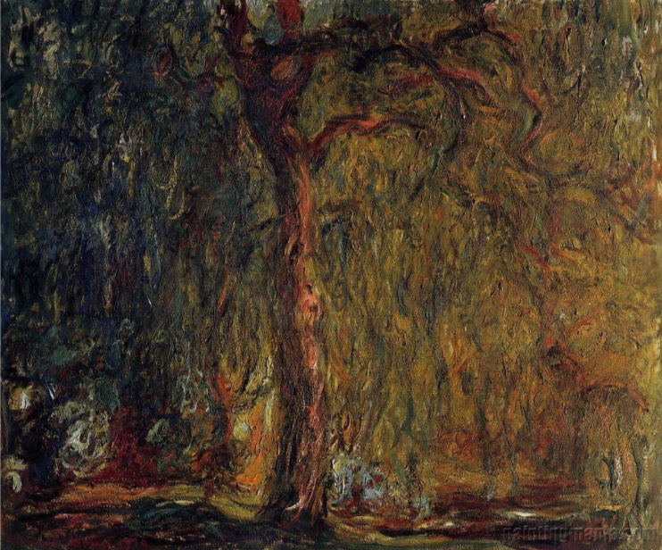
|
Inspiration
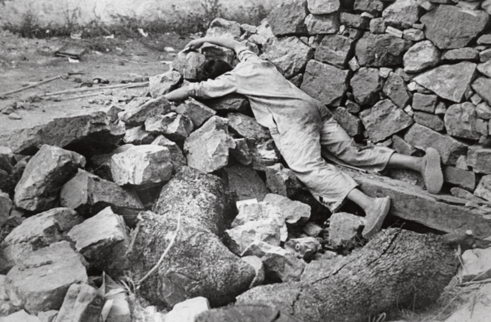
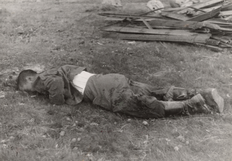
~~~~~~~~~~~~~~~~ This piece was inspired by “Weeping Willow” by Claude Monet, and “Body, La Granjilla, Cordoba front, Spain” and “Corpse of a Republican soldier, Navacerrada Pass, Segovia, Spain,” by Gerda Taro. Inspiration was taken for color palette choices and visuals. The theme of death was also taken from all of the paintings. For Monet I took inspiration off of his warm tones throughout his painting, as well as painting techniques. I wanted to have the contrast of the saturated warm tones of Monet's painting and the monotone colors of Taro’s pieces. I also took inspiration from his painting with his weeping willows. I know that Monet was heavily inspired by Japanese culture and their tradition. The weeping willow is associated with ghosts and it is popularly said that a ghost will appear where a willow grows. With that information I wanted to have the weeping willow in my piece too. Technique wise, I knew that I wanted to use quick flicks of the brush, like how Monet uses in his painting. I also wanted a similar movement in my painting, where Monet's painting shows movement vertically due to the vertical lines that make up his tree. During World War I, his younger son Michel served, and his friend and admirer Clemenceau led the French nation. Monet painted a series of weeping willow trees and water lilies as a way to honor the French fallen soldiers. Monet was acutely aware of the war, as the peace of his garden was sometimes shattered by the sound of gunfire from the battlefields only 50 kilometres away. I took Inspiration from Monet creating paintings to honor deaths from a war. While he was honoring war deaths, I painted my painting to honor the deaths of suicide victims. In 2018 alone, 48,344 people committed suicide, making that about 130 everyday. As well as with 1.4 million attempted suicide reports. And again that 1.4 million people, was just what was reported. My painting shows a young woman falling off a cliff, and her body is turning into a cloud like structure, which is meant to symbolize her soul. Throughout the painting one can see multiples of these clouds like things floating around the painting. While Monet painted weeping willows for his symbol of death, I painted those red spider lilies in my painting, kind of exploding out of her body. I also took inspiration from “Body, La Granjilla, Cordoba front, Spain” and “Corpse of a Republican soldier, Navacerrada Pass, Segovia, Spain,” by Gerda Taro. For “Body, La Granjilla, Cordoba front, Spain” I mainly just took inspiration from the rocks that are visible in taro's photograph. as well as of course the dead body. In “Corpse of a Republican soldier, Navacerrada Pass, Segovia, Spain,” by Taro, I really only took inspiration from the tones in Toro’s photo. I knew that I didn't want to have a plain black and white painting, like in “Corpse of a Republican soldier, Navacerrada Pass, Segovia, Spain.” Though I did take inspiration from “Corpse of a Republican soldier, Navacerrada Pass, Segovia, Spain,” with the huge contrast between dark and light in her photo. |
|
|
Experimentation
~~~~~~~~~~~~~~~~~~~~~ First to practice using my paints, I just filled in the trunk of the tree with the black paint stick that I had, then I just went in with the yellow color that I had to start the leaves. I just started with the paint stick on the paper and swiped up with each stroke and I just went in with all of the colors I had except, blue and red. Then I tried a technique with using a rounded brush and getting the paint on the brush and swiping up with that. I also tried to use some of the acrylic paints that I have, I know it's like a sort of rule to not mix painting with acrylic and oil on the same canvas but I didn't have the colors that I wanted to use with my oil paints so I just had to use what I had. At that point, I still didn't really like it, but I at least knew where I was going with the paint, and that was enough for me to feel comfortable to start on the real thing. |


|
Process
~~~~~~~~~~~~~ The first thing I did when making the actual art piece itself was to build my canvas and put on the gesso. Then I sketched out what I was going to do just so that I had an idea of what it was going to look like and if I liked the placement. I've marked on the sides of the canvas where each layer of the drawing was going to be. I made a mark of where the ground was where the tree branches were splitting as well as how thick the tree was at the bottom of the canvas. I then started ripping up my paper bags, And crumbling them up to get some nice wrinkles. Then I just went on with Modge Podge and put all of my paper on the canvas. I don't know why I decided to leave the edges bare but I just liked it. Then I used a charcoal piece to sketch out my drawing using the small lines that I had at the edge or reference as well as my sketched paper. I had to use charcoal pieces because using regular pencil was not working on top of the modge podge. I even took a picture of it and went in on my phone and sketched out on top of my sketch what I was going to look like just to make sure it looks like my original drawing. I had to do this because just stepping back from the page I couldn't really see my drawing very well so I just wanted to make sure that it was accurate and what I wanted. |
|


|
|
When I got the painting I just started out with a layer of my yellow oil paint just to get a base down. The next thing I did was use the paint stick of a more white color and do my little swipe up motions that I did in my practice. I also went in with my brown color as well as a little bit of the red. I didn't want to use too much of the red because it was a shinier color and I didn't really think it matched with anything else, but I did want that reddish copper color in there. Then I went in with my white color again trying to just fill up some of the space. It was around this point in time where I absolutely hated the peace and did not know if I was going to be able to create something that I liked. I had to take a small break and step back from it and just kind of calm down because I absolutely hated it.
|


|
When I came back to it I just kept on adding more colors and more dots. At this point it became less of Monet's style from the inspiration piece and just became even more of a Pointillism piece. Monet's style is much more of a quick flick of a paintbrush rather than how a pointillism artist would work. But it does kind of work because in a very specific portion of his painting at the bottom left, it does seem to have less of a paint stroke in more of a paint dab, per se. Regardless, I did end up liking the way that the painting turned out with this style. I did try for a small portion of time using a thin brush and doing the quick Strokes but the paint was just mixing too much and it created more of a muddy mess then what I was going for. so I scrapped that idea and just went with more of the pointillism Style, but I did try to stay close to his color palette.
|
|


|
|
I then copied the same steps and the rest of the painting that deals with the leaves and I moved on to the trunk of the tree. I do wish that I made the left branch thinner though. The way I did the tree trunk and branches was just taking my black oil paint stick and going over my lines that I had that were in charcoal. it wasn't quite working out the way I wanted to because I wanted more of a definite line rather than what it was giving me. so I had to use my paint brush and make those lines from the paint. I then did some quick shading on the tree just to get a nice shadow because I knew I didn't want to paint the entire tree, but I did want the details. After that I took my oil paint stick and went over all of the wrinkles that the paper gave me just to give some real definition. Next I lightly went over the rest of the tree with the paint stick just so that the Risen wrinkles would likely catch the paint and it would have some texture on it.
|


|
I wanted the tree's leaves to be very Monet, but then the rest of it where the details were going to be semi realistic to look more like Gerda taro's photographs. After I finished the tree I went on with the rocks. The way I did The Rock's was basically the same way that I did the tree, which is to make the outline of them, go over the wrinkles, and then Whiteley go over the rest of the rock so that the wrinkles would catch the paint. I did try out a different technique with my first rock that I was doing, the one on the top left, that I did not end up liking but I couldn't exactly undo it either. so after I figured out how I wanted to do the Rocks when I did my second one using the previous technique, I tried to fix the other one by really emphasizing the wrinkles, and make the other ones a little bit more like the other one by as well as using the previous stated steps, I also very lightly colored in the rocks with the slightest out of paint on my paint brush, after I did the initial outline of each Rock.
|

|
|
|
The last thing I had to do with this painting was create my Corpses. I wanted to have the pop of color in this piece, but I didn't want it to be too distracting and I also wanted to stick with keeping Monet's color palette. so the way that I was able to compromise, was I used a blue oil paint stick.In Monet's painting he has some blue in it on the left, and I was kind of upset that I didn't have that in the tree leaves, so I was able to bring the blue in by using that to color my Corpses, but it was a shimmer paint, so I was able to get the color palette correct but also use my own style of having a nice pop. I would also like to point out that the person sitting leaned up against the tree is not a corpse, they're just kind of sitting there and it is up to a viewer's interpretation of why, but my idea was that they were the Lone Survivor in something horrific. Because Gerda Taro photographed some pretty horrific scenes, I wanted to tie that into my painting. The way I painted these people was to outline my sketches with the paint and then lightly shade it with the lightest amount of paint on a paint brush.
|


Reflection
~~~~~~~~~~~~~~~~~~
Overall I do like the piece, but there are definitely some changes that I would like to do if I wasn't scared I'd mess it up. These changes would likely include fixing that rock that I messed up on, as well as trying to make the leaves look closer to Monet’s style. Something that I do think that I succeeded in, was making the subject of the tree look similar to Monet's tree overall. Also I think my favorite part of the entire painting is the specific Rock on the bottom right of the canvas. I like the shape the most and I just think that my technique was the best on that rock. this was definitely the piece that I struggled the most with liking, and I'm not sure if that was because I was using a new medium or what, but I have used new mediums in the past, and I like how they were so I'm not really sure if that was it. I just think that maybe because it doesn't look quite what I had in my mind. I wanted the tree's leaves to look like they were all around, As if the point of view in this painting is supposed to be Sort of at the base of the tree trunk like the leaves are all over. I feel like in order to accomplish this maybe I would have needed some shading in the leaves.


SImilarities and Differences
Similarities-
- Color, I took a lot of inspiration from Monet's Painting for the color. I tried to make the leaves as close to the warm tones in his painting as I could with what I had available. For what I did have, and could spend on, I think the colors worked well. I do wish I was able to pull in some more of the blue colors, but where I was lacking, I put the blue in as my color for the bodies in my painting. - Subject, I made the main subject a weeping willow , like how Monet did. Although my tree didn't look much like a real willow, it was the closest I could do with my skill set with the material I was using. Differences- - Technique, I tried the best I could to do the quick swipes that monet did for his painting, however, the paints just kept mixing together too much, and it just wasn't working, so I had to do a different technique. The way I put the paint on the canvas was by dabbing the paint stick on the canvas, instead of swiping it. - Obvious, some of the clear differences, was the look of the piece, I have the rocks and people in it, where as the only subject of the piece Monet made was the whillow. Another clear difference was the fact that I didn't fill the whole canvas ẃith paint, while Monet did. |

SImilarities and Differences
Similarities-
- Subject, a similarity between my peace and Taro’s peace was the rocks. I wanted to have a strong connection between my peace and her piece, and this was one of the ways that I did it. I didn't want my entire piece to just mainly be Rock still so it's more of like a subtle similarity. Another thing that I wanted to take from her was the corpse. Differences- - Color, the color was just in just black and white while mine obviously has color in it. although I did want to use I just black without any other color for the tree trunk and the rocks. |

SImilarities and Differences
Similarities-
- Subject, I wanted to have a dead body in my painting, but I also wanted to have the corpses just laying on the ground, similarly to how her dead body is in the photograph. Differences- - Color, similarly to the other photographs that I was inspired by I didn't take a lot of inspiration based on the color because I wanted to use Monet's color palette. |
https://www.paintingmania.com/weeping-willow-4-7_4193.html
https://www.icp.org/browse/archive/objects/body-la-granjuela-cordoba-front-spain
https://www.icp.org/browse/archive/objects/corpse-of-a-republican-soldier-navacerrada-pass-segovia-spain
https://www.aftermath.com/content/us-suicide-statistics/
https://www.icp.org/browse/archive/objects/body-la-granjuela-cordoba-front-spain
https://www.icp.org/browse/archive/objects/corpse-of-a-republican-soldier-navacerrada-pass-segovia-spain
https://www.aftermath.com/content/us-suicide-statistics/
