|
Exhibition
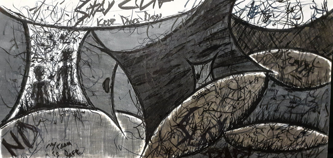
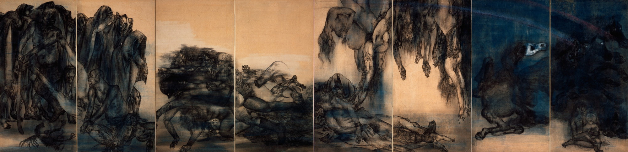
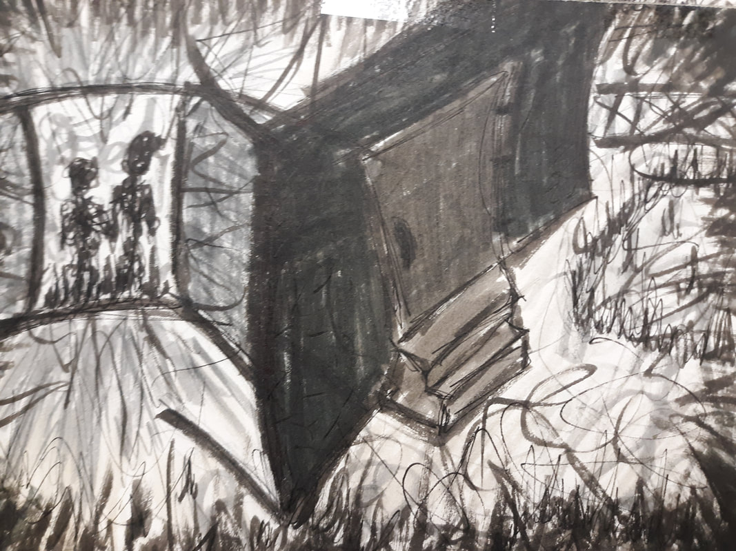
~~~~~~~~~~~~~~ Inspiration was taken from Abram Guthrie and his painting The Time Machine, as well as Maruki Iri and Maruki Toshi and their painting IV Rainbow. This drawing was made to demonstrate how I see the world as well as The Narrative of “what if when I open my doors, everything I'm scared of will come crashing through the entryway?” 

|
Inspiration
~~~~~~~~~~~~~~~~~~~ This drawing was largely inspired by Abrahm Guthrie, as a person but also his specific piece of art, The Time Machine. Abrams states that his work is a glimpse of a time or several points of time together, and that he creates narratives about people he's known in the places he’s been in. He also stated that his house became a manifestation of his family, and it was barely held together, until it broke. I wanted to create a piece that shows how I see the world outside. He says he creates his art based on a memory of where he's been, so I did that too; I drew my backyard from memory as well as my bedroom door. I wanted the people to represent specific people from my life that made me struggle. I also wanted to demonstrate how in a way, the outside world scares me and why I would always keep my door closed, because I was scared that if I opened it, what scared me, would come in. I had the pleasure of listening to a lecture by Abram, where he said that he likes to create something that even without much detail, you can still see what it's supposed to be. I wanted to do something similar with how even without much detail and it's a very chaotic drawing, with a lot of emotion, that the people are obviously portrayed as scary people. Like I said, I was also inspired by his specific piece of work, the time machine, and this was mostly because I liked how you couldn't really tell the point of view of the painting. I also liked that there was a wall separating two rooms; there are essentially two scenes. I wanted to do something similar with how I have two different scenes but I put them together and I separated them with just the wall of what was supposed to be the outside of my house. Obviously in terms of medium, artist style, and color, they're two totally different pieces, but I did really want to have a drawing where I couldn't really tell the point of view, and had a way to show two different scenes in one work of art. I was also inspired by Maruki Iri and Maruki Toshi and their painting IV Rainbow. Iri and Toshi were a married couple who painted large panels in memory and honor of those who passed away in the Hiroshima bombing. They’ve both lost multiple family members and Friends due to the horrific scene.They said that the atomic bomb was an “instant cause of death” to more people than they could ever honor through their paintings, even if they were to paint constantly for the rest of their lives. In an interview it was stated that after the bombing no one could talk about it for a long time, but they were not okay with that, and that's why they chose to do the panels. I admired them for their efforts to bring honor to those lives that were lost, but was specifically inspired by a piece that they did called IV Rainbow. I was inspired by the color usage, as well as the drawing style. I wanted to do something similar with how it looked like on their piece, there was color placed down in an organic matter, and then ink was used to outline and detail. I also wanted to use what that they did in color, with how they used blacks and muted neutrals, but also a pop of a ‘night sky’ blue color. |
Planning
~~~~~~~~~~~~~~~~~~~~~~
~~~~~~~~~~~~~~~~~~~~~~
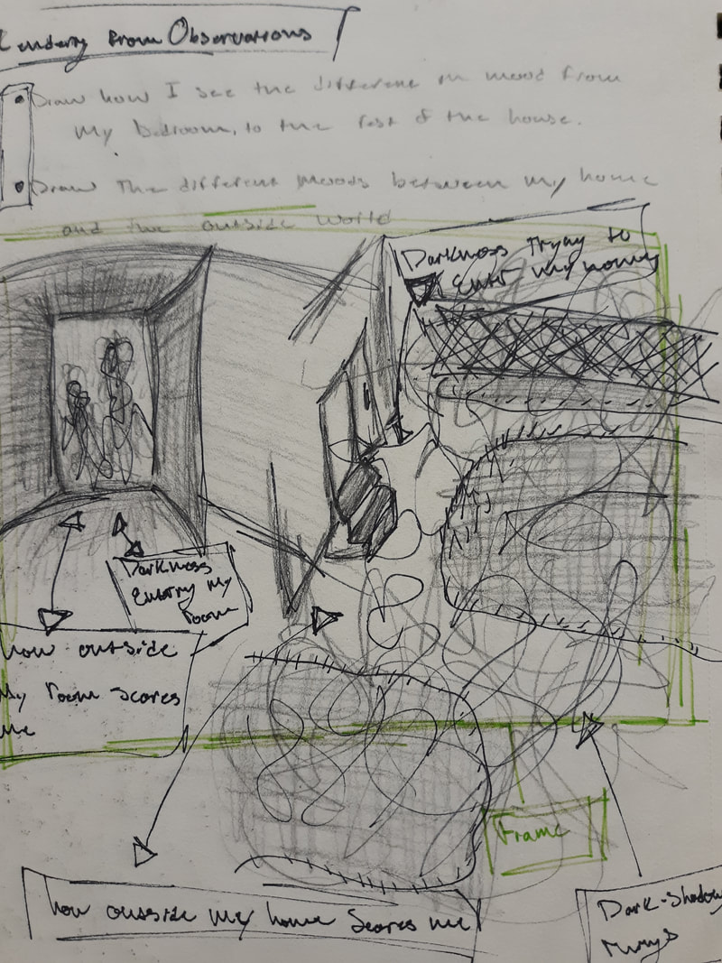
The idea of this piece was because of a prompt given by an art class I am taking, as of November 2021. One of the Prompts was, “for this project, students will consider space, objects, lighting and representation as tools for expression and narrative.” We were given some guiding questions, a couple of them being “how can you tell a story through the particulars of your space?” and “how can you construct mood through lighting color and or approaches to representation?”
When I was thinking about that prompt,I thought about how I've been complaining to my friends lately about how I've been getting more and more scared to leave my home. At first I was thinking of two different scenarios to do. I wanted to create a piece of artwork to show how I see the outside world, and I wanted to create a narrative where I let my doors open and everything that I'm scared of comes rushing through the door. I drew up the two sketches supposed to be being two separate ideas, but seeing them side-by-side I liked the look of it and it reminded me of Abrahm Guthrie's piece. then I came up with the idea of combining both of them.
When I was thinking about that prompt,I thought about how I've been complaining to my friends lately about how I've been getting more and more scared to leave my home. At first I was thinking of two different scenarios to do. I wanted to create a piece of artwork to show how I see the outside world, and I wanted to create a narrative where I let my doors open and everything that I'm scared of comes rushing through the door. I drew up the two sketches supposed to be being two separate ideas, but seeing them side-by-side I liked the look of it and it reminded me of Abrahm Guthrie's piece. then I came up with the idea of combining both of them.
|
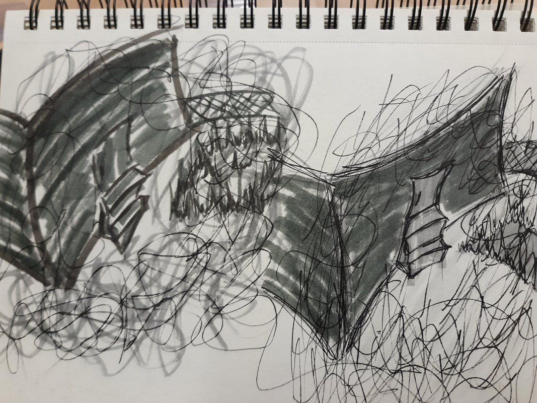
As I do with all of my works of art, after I come up with a miniature version of my sketch, just to get the idea down, I create a larger scale of my sketch with much more detail and a closer look at what I'm wanting to do. I came up with the idea of making everything look old and decrepit, as well as having a few phrases posted around the piece of art.
|
|
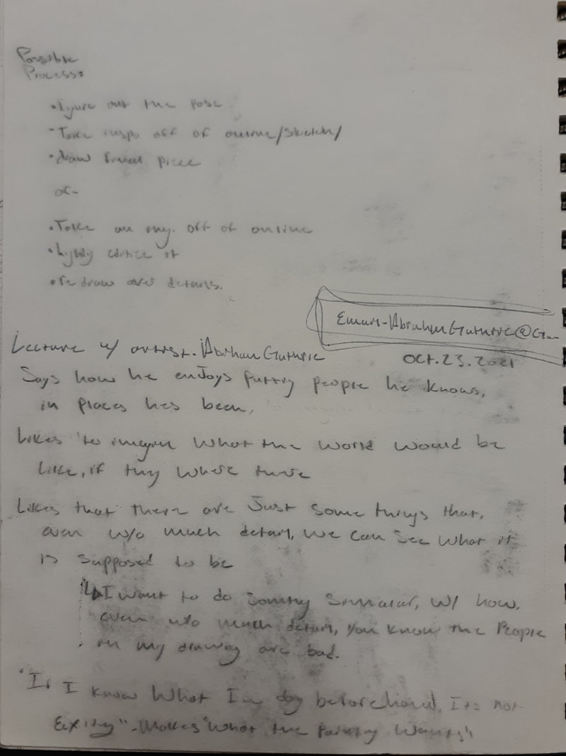
This page was written out during a lecture given by Abrahm Guthrie at my art class. I knew that I wanted to take advantage of the fact that he was there and I could get some quotes of things he set to us. some of the things he said was how he enjoyed putting people he knows and places he's been, and that he likes to imagine what the world would be like if all of the people he knew were in one room.Something that stuck with me though, was that he said he likes that there are just some things in this world that even without much detail put into the art, you can still see what it's supposed to be. I related to this because my style of art is a mix between abstract and realism, and I love making things look so chaotic that sometimes it's hard to tell what's exactly going on, but you can kind of still see the grand picture.
|
|
|
|
On this page my goal was to figure out how exactly I wanted to draw my human figures. in my initial sketch I had them as kind of just squiggles because I didn't really think that I was going to just want a full shaded in figure, but obviously I wouldn't know how I wanted to draw them if I didn't at least play around with a few ideas. I sketched out my first idea, everything being one line, with no 1 set outline of the figure. also playing around the idea of making it look like it was emerging out of the ground. my second idea was using hash marks to create the human-like figure, again with no set outline of sad figure. I didn't really enjoy this one because I feel like I didn't exactly go with the style of my large scale drawing that I did. in the drawing I have a lot of squiggling things being representative of evil, so I still thought that my original idea was going to be what I was going to end up with but I still want her to play around with something else. making my last idea being a full shaded in figure, almost looking like a Stickman. but the way I drew it, I kind of look like an alien, which made me want to see what it would look like if I had the head tilted to see if it would add to any sort of scary Factor. in the end I did end up choosing the 1 line, squiggly mess of a human figure.
|


At the bottom of my page I drew myself the steps in which I would draw my little person .The idea was to First come up with the basic shape of what I wanted my figured I'd look like, using pencil. doing this would ensure that I would just have enough room, or basically just have good spacing between each figure. my second little step was drawing and my little squiggles to see if I liked the way it looked. then finally using whatever link I was going to end up using over the squiggles. I also played around the idea of erasing half of my little figure because I didn't know if I was going to want to have the added darkness of the pencil marks, or just have the ink.
|
The next thing I had to do was figure out my coloring technique. the markers that I chose to use for this drawing we're fabric Castell markers. I chose these because on the packaging that I saw for these markers it showed kind of the idea of the coloring technique that I was wanting, just less chaotic. so I figured if these markers can create an art look that looks like that then I could do that but just “ more.”
My first idea for coloring I used to the marker warm gray V 274 to outline everything, and then I went in with cold Grey VI 235 for the Outdoor wall. I use cold Grey III 232 for my wall what's supposed to be my bedroom wall and floor, and warm Grey IV 273 for the outside door and My human-like figures, warm Grey III 272 for the stairs. then I used warm Grey I 270 for the outside ground. last lie I used all of previously stated Mark colors for the squiggles and Shadow around the perimeter of the drawing. |
|
I did like this drawing, I did end up choosing this for my final piece 4 my art class, due to time restraints. but like I said I do really like this drawing I love the chaos that I can see in it, and it looks very emotional. the only thing that I didn't really like about it is maybe actually that it was to dark, and I didn't like the outlining of everything being a marker. all so at this point I didn't know if I wanted the two drawings to clash together, or if I wanted the outdoor wall to be over my bedroom wall or vice versa. so it kind of just looked like a muddy mess.
|
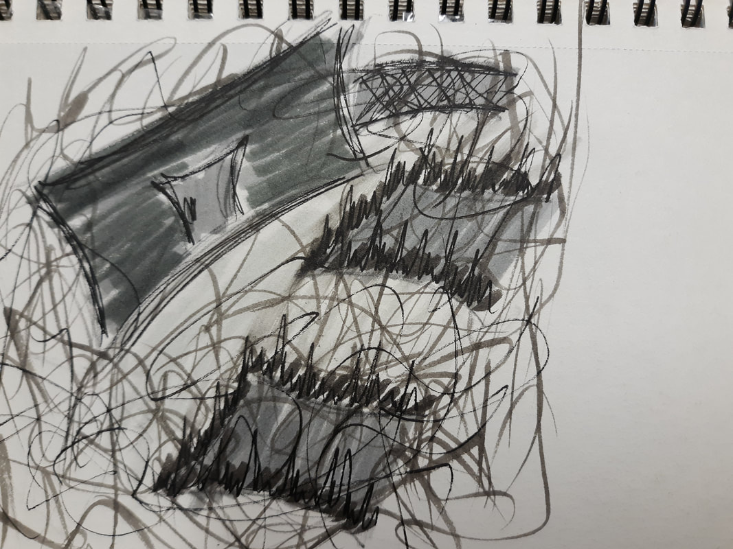
Next I wanted to see if brightening up the drawing a little bit would make it better, and if I really just didn't like the marker being used to outline everything. So I used warm gray IV 273 for the outlines and cold gray III 232 to color in the wall and put some squiggles around the drawing. then I used a pain to try and see what it would look like 4 a pen or ink to be used in the final drawing.
I like the look of the pain over the marker, and I also liked the lighter color of the wall and everything. but using the marker as an outline for the wall, I don't know if it's just the color I was using or if I really just did not like it, but I knew I wasn't going to do that anymore. I tried it again on that same page using that same gray color to shade in everything,, But then I wanted to use my pen to do the outlines and scribbles. Look up that better, Because it looked much more clean. But I did like the look of the marker in the pen for the scribbles For my first attempt on this page. |
|
This page I did the same thing as my second attempt, on the previous page, Except i combined the two, I wanted the scribbles of the first one,But the house of the second one. I also attempted to make the grass marker as well as using a pen on the grass. Also added color cold Gray I 233 for the ground, I didn't think it was dark enough,Or warm enough, because my inspiration piece from the Maruki’s Had some warmer tones to it so I wanted to make sure that I implemented that into my piece.
|
|
|
|
My final decision for How I was going to color my piece was To basically do what I did in my previous experimentation Except I added a lot more squiggles as well as I made the ground warmer using warm Gray I 270. I took note of the different colors used throughout the process, just so that I could make sure that I didn't accidentally use the wrong color for something.
I liked this version the best because I felt like it was the closest in color to my inspiration piece, But also kept it my style. It still wasn't quite what I had in my mind, because in my mind I thought it was going to be a little bit more chaotic, Like how I did in my first experimentation, But I kind of just assumed that it was because it didn't have all of the detail that I've had in my mind to put onto it, like how I showed in my full scale sketch of the drawing. It was just kind of my hopes that it would work out in the end. At this point, I also knew that I wanted the outside wall to overlap my bedroom wall. |


Process
~~~~~~~~~~~~~~~~~~~
~~~~~~~~~~~~~~~~~~~


This drawing doesn't have any more photos of it being finished because at this point I did lose the project. Basically what I've done up until this point.Was sketch out my drawing and then I Used a kneaded eraser to get rid of any dark lines that I had.i did this because i knew i was going to use marker and some of the colors that i was going to be using or very light colors, and i didn't want the Pencil to show through underneath the marker.After I had my basic shapes for what I was going to do on my paper.I just started drawing coloring in each piece.
This started with the outside wall that I had,I'm not totally sure what color I used, but I think I used cold grey VI 235. Then I moved on to drawing inside of my grass patches using either That same color or cold grey IV 235, and then fence using what looks like that same color. Then at that point, I'm pretty sure I let it dry because my paper got a little messed up from all of the markers going all over it. At that point was the time when I colored inside the door as well as the concrete patch.I didn't fill in the concrete patch all the way to the edge and I didn't make it as neat as everything else because I kind of liked the difference in texture it gave it.
At that point when I tried doing the bedroom walls And my little human figures, My marker was starting to dry out. This was likely because I kept using the same marker for every part of the cold grey tones that I was needing. To go back to the store and get a new pack of markers. At that point, I just continued on with my coloring.
Next I tried doing the floor of the bedroom. Because I wrote down in my sketchbook which markers are used for what parts, I knew what colors I was doing for the floor, however when i was doing the ground for the outside portion of this piece, one or both of my markers must have been dirty, because when I went in and did the same coloring for the bedroom floor it wasn't the same colors. I tried adding some of my cold grey tones to the floor but it just was not working right. At that point I did my background for my little human-like figures as well as what's maybe supposed to be the ceiling portion.
I used my cold grey VI 235 marker to accentuate some of the scribbles in my human-like figures. After that I went back in and.Added some more Gray tones to the floor because I was just not happy with how it did not look the same. if the colors were obviously different it might not have bothered me so much, But because they are just slightly off from one another it was even more irritating. Actually I did end up making it a little bit too dark so I tried adding some of the onto to the outside ground, But it still looked different.
This thing I did was do some darker outlines for each of my walls, And everything else. It kind of did bother me a little bit to have to do this because it was one of the things I did not like about my experimentations. However with all of the coloring that I was doing, especially with the areas where my marker was starting to dry, I had the edges be all messed,And every once in awhile when I was coloring my hand would kind of twitch, which would make me color outside of my lines. So although it was one of the main things that I did not like about my experimentations, I tried making it look as clean as I could,And I also didn't use The same color palette that I used from before, so I was really hoping that it was just gonna look decent.
After that I started playing around with some of my scribbles and doing some of the detail work with my Micron markers. For this, I used both the PN and the 08. I wish I would have remembered to keep some of the patches in The outside wall lighter, Because I feel like it would have just looked better if the bricks showing were lighter. I don't remember which markers are used but it was likely the warm Gray III 272. After I shaded in some patches, I went around each patch with my markers and scribbled in bricks. I didn't want it to be too clean because obviously,I want this to be chaotic, But I wanted it clean enough to where you can kind of guess what it's supposed to be.
After I did that, I started coloring in some of my grass as well as the fence, and then I also went in and added, For whatever reason, messy lines for the bedroom wall. The last thing I did before I lost the project was adding a bunch of scribbles coming out from the open door of the bedroom.


Part of me is grateful that I lost the first drawing because there were many things that I did not like about it. First of all I changed my mind in the exact layout of how I wanted the drawing to look. Before I had the bedroom wall have both top and bottom parts curving down, but I wanted to change it to where they go in the opposite direction. I don't even know why I chose to have them both go down in my original piece because it doesn't even flow with any of the rest of The drawing, because everything else has everything going in opposite directions. I also chose to not have everything be one same marker color. But a lot of the grey tones, but I didn't want that same cold Gray tone to be everywhere. I also didn't want it to dry up too quickly again. Another change that I wanted to do was change the fence to be more of a brown, like how I did in my Original final color. And I don't even know why I changed it to Gray, I probably just forgot that I had it as brown.
Pretty much all of the steps I did for the final were the same for the original, except I changed the colors.
Ground(o.s) - warm grey III 272, IV 273, and IV 273
Ground(b.r) - cold grey III 232, and warm grey I 270
Sky - cold grey I 230
Fence - cold grey VI 235, and warm grey IV 273
House - (multiple layers) cold grey VI 235, and IV 233
Grass - cold grey VI 235, and IV 233
Only a few notable differences between what I did differently was, I used both the Fabric castells as well as the Micron pens To do the hash marks, I also made the difference between the ground outside and the floor inside be different colors, I also made both doors different.
Finally what I did that I didn't get to do in my previous attempt at this drawing was adding the final ”evil” squiggly lines, as well as the phrases I put rap drawing
Refection
~~~~~~~~~~~~~~~
~~~~~~~~~~~~~~~
Overall I really like this drawing, what I saw on my head that is what eventually came out. I feel like my intention to create the narrative that was in my mind was successful. Something that was challenging with this piece was, not only the fact that I lost the first one, the materials that used. If by some chance I were to use marker and another art piece, which I doubt I will, I doubt that I would use fabric Castell markers. This is because although they work beautifully when first out of the package, they do tend to dry up a lot quicker than I thought they would, and for a marker these aren't exactly cheap. Strangely enough I feel like my favorite part of the entire piece is either the door I have for the outside, as well as my fence. I really like the texture I put on that door, the fence just looks satisfying to look at.
Something that was said by Abram Guthrie during the lecture I had with him was “ if I know what I'm doing beforehand, it's not exciting." he says he makes, "what's the painting wants." I probably could not disagree with this statement any more than I already do. This is because I am the type of person we're especially for at least a big project like this, I need to know what I'm going to be doing in order for me to feel like I'm doing the best job I can. Even for some of my personal works I may not know exactly what I'm going to end up being making, but I have an idea and I have an emotion that I'm wanting to get out.
Something that was said by Abram Guthrie during the lecture I had with him was “ if I know what I'm doing beforehand, it's not exciting." he says he makes, "what's the painting wants." I probably could not disagree with this statement any more than I already do. This is because I am the type of person we're especially for at least a big project like this, I need to know what I'm going to be doing in order for me to feel like I'm doing the best job I can. Even for some of my personal works I may not know exactly what I'm going to end up being making, but I have an idea and I have an emotion that I'm wanting to get out.
