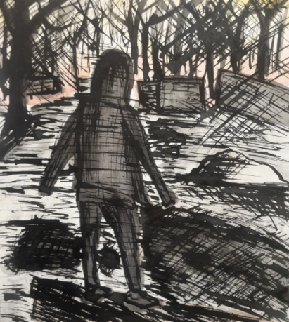
Title: Standing Alone Now Size: 7x8 inch Medium: ink/watercolor Date of Completion: Sep. 29th. 2021
|
Exhibition
~~~~~~~~~~~~~ "Standing Alone Now" is an art piece inspired by Martha Hayden's The High Point, Smith and Ninth as well as an image taken of me when I was a few years younger. This art piece was created for the intent of remembering a Time when I was younger and had no clue how many worries I would have in just a few more years. 

|
Inspiration
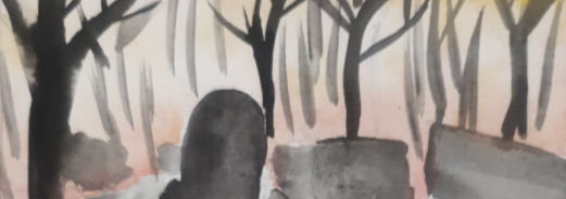
~~~~~~~~~~~~~~~~~~~ Martha Hayden went to Europe on a fellowship after graduating from The Art Institute of Chicago in 1962 and completed her studies with prominent Expressionist painter Oskar Kokoschka at the Schule des Sehens in Salzburg, Austria. She earned the school's most prestigious award for her efforts there. After that, she traveled throughout Europe, painting and studying the work in museums, spending time in Austria, Italy, Spain, and France before returning to the United States and painting in Mexico. Martha now splits her painting time between New York City and southern Wisconsin, but she also travels and participates in artist residencies in various parts of the country to gain new observations. I wanted to use Martha's image as an inspiration because lately I have been loving using ink, and the way she was able to combine color and ink was just so inspiring to me. I also love the way she used the different contrast in tones in color with the dark blues, almost black of the buildings and then the almost Bright get also muted tone of the maroon sky. I wanted my image to also have a contrast in right and dark, and also have an etching using ink overlaying the color to give more detail. Her painting/ drawing also almost looks baleful, and I wanted mine to also give off that affect. For my second inspiration image I found an image that I had forgotten about that one of my friends took of me when I was a little younger. I remember this day because we were exploring the train tracks by my house and we saw this piece of wood just sitting there, and I wanted her to just take a picture of me standing on it. I wanted to create an art piece out of this photo, so that I could have it hung up as a constant reminder of when I was younger and I was able to go and explore outside. I wanted to connect this piece of art to my overall theme of the rest of the art I usually create of Mental Health in the way that a lot of people as they get older they start to reminisce about their younger times even if it wasn't even that long ago. For example, this photo is only a few years old, but I understand that I’m a completely different person from that person in that photo, and I have many different other worries that I had then, as well as responsibilities. I also just wanted to create this photo as a piece of art because it went really well with my inspiration photo from Martha Hayden. I saw a contrast that I’d be able to create for the sky and the rest of the image, and with the image that I had in my mind for how I would be able to create this into an art piece was able to give off the feeling of baleful, that I was wanting. |
|
Planning/ Process
~~~~~~~~~~~~~~~~~~~~~~~~ The first thing I had to do when preparing to make my drawing, was map out the shapes I would need. I took my original photo, and, on my phone, in blue, I drew the horizontal lines for the ground. For the girl, I outlined the basic shapes of her in purple. And in red was for the details of the snow, tree, and houses. Doing all those first steps made it easier to map out how I was going to start my drawing. All I had to do after that was re-draw those shapes on my paper. After I was done sketching it out, I went over it with a kneaded eraser, because I was then going to go over it with watercolor, and I didnt want the pensil to come through the color. After I just had a light sketch left on my paper, I started the watercolor. |
|


|
I started with the sky, because I didn't want to have to be too careful with my placement after I had black down, because I would be too scared the black would re-wet, and bleed through to the light colors. To do the sky, I just went over the whole sky part with water, then added the red, orange, and yellow, allowing it to flow pretty freely. Then I just kept adding more color where I wanted it the most vibrant. The inspiration piece that I used had the sky pretty saturated, so I just tried my best to do the same. In between adding color I would use a paper towel to dab the paper here and there, bringing back some of the white from the page, to make it look more cloudy.
|
|
Then, after the sky was done, I moved on to the wood at the bottom of the paper. I filled in the entire shape with water, and then I just filled it in with the brown color that I had. Then I dabbed part of it with a paper towel, and then I just thought that it was dry. After I was done, I moved on to see houses in the background. because the sky was already dry by then, I was able to just fill in the shapes with water and then the black color in there letting it flow. After I was done with that I moved on to the snow at the bottom of the page.
|


|

|
The snow is hard to do because I didn't want to just leave it white, so I had to add some color, but not too much. I decided to go with using the tiniest bit of orange and yellow, imagining that it was like a reflection of the sunset background, or just that the snow was dirty. From my inspiration photo, the ground was black so I tried recreating that with the black that I had. It was pretty difficult trying to make it look like the black at the bottom of the page was the ground, but I was hoping that once I went in with the ink, that it would help with the illusion. I also didn't want it to be just black so I kept dabbing it with the paper towel and adding more black here in there. then I started with the pavement. I basically did the same thing that I did with the wood piece, where I just added water and then dabbed it with a paper towel here and there. I didn't want it to be too pigmented though, so I made sure to not add a lot of pigment on my brush beforehand.
|
|
The painted girl I just used black with a little bit of purple, just enough to give her a slight tint. I had to first make sure that everything was dry before I went in to paint her, but after I did that, I just filled in the shape with the water, not worrying about the shape too much because I knew I was just going to go in with the ink anyway, and then filled her in with the color I chose. Then like everything else in this piece I dabbed it with a paper towel to lighten it up a little bit. |

|

|
The last thing I did with the water color was add the trees in the background. I knew that I was going to do a lot of the trees with the ink, so I didn't really bother with the shapes of this too much. |
|
The first thing I did with the ink was just outline everything. Then I tried to add in some more dimensions by adding the Shadows on the girl, the snow pile, and the wood piece. and then I added some hatch marks where the ground was showing through the snow at the bottom of the page. And then I just started doing some hash marks at the top of the page and then I let that all dry. I let it dry for a little bit so that the ink wouldn't bleed into pools when I was adding even more hatch parks. |
|


|
When everything was all dried I just went to town on making a bunch of hatch marks, darkening up Shadows, and adding more trees in the background. My inspiration picture from Martha Hayden had a lot of hatch marks, so I just tried to recreate that in my picture. |
Reflection
~~~~~~~~~~~~~~~~~~~
As a finished piece, I do really like it. The intent behind this, was to create an artwork out of a memory that I could hold onto, and that goal was achieved. I like how I was able to recreate that memory in a way that I actually visualize it in my head right now. Because the photo was taken a few years back, its not like I can just remember it like it was yesterday, but the way I'm remembering it right now, is actually with some literal fuzziness around the memory, and those hatch marks. I also liked how I was able to recreate Martha Hayden's style a little bit. The only thing I wish I could have done better would have been to make it a little bit more ominous than how it looks now, as well as just darken it up a little bit to tie it to Martha's just slightly more.


|
Similarities and Differences
Similarities-
- Something I love about Martha Hayden's piece is that she uses two main colors that contrast each other really well, and in various tones of each color. I took a lot of inspiration based off of this fact, by using only a few main colors, and then variations of those colors. Another similarity between the colors she uses in the colors that I used, is that she used a bright color for the sky, and then a very dark blue almost black color for everything else, and although my sky was brighter, whereas she used a almost dull yet still bright color, I still kept the concept of having a bright sky and dark everything else. - Another similarity between Her piece and mine was the use of hash marks. We both used hash marks to give more detail in our pieces, where the color was lacking, and we also had some random hash marks throughout our pieces. |
Similarities and Differences
Similarities-
- Because my art piece is a literal recreation of the photo, there are bound to be obvious similarities, like the structure of the piece, where the brights and darks are, and the subject. Differences- - Although the art being a literal recreation of the photo may be what gives it a lot of similarities, it also is what givers it a lot of differences too. Like how the art piece only uses few colors in comparison to how a real recreation would use. its obvious to say as well that, the original photo doesn't have hatch marks throughout it either. Also, the warm tones where brightened up a lot more, as well as how the shadows where darkened up a lot. |
- We also had a similar mood to her pieces, which I saw as ominous and baleful. Although, truthfully she did hit that mood better than I did, but the intent was there.
Differences-
- Some differences between our pieces were mainly just the subjects between each piece, her subject in her piece was the buildings and or the sky, where my subject was the girl standing alone.
- Other than the obvious subject difference between the pieces, there were also differences between the color usage. Although the intent of my piece was to have only really one or two colors and then variations of the colors, I didn't quite hit that mark where as she did. In her art piece, she used a bill version of maroon that still had hints of vibrancy where it was more white, and a blue almost black color, meaning that she only had real colors throughout her peace. In my peace it really only looks like I'm using maybe three or four colors but in reality, I used about six different colors with different tones of each color. I used small amounts of red, yellow and orange to create the sky, and then I also used black purple and brown to make everything else, although in the sky you can't really see that I used three different colors and maybe only looks like I used to, again I still did use three. And in the girl standing alone, it may only appear to be black but I did use purple in that too. So again although the intent was to only use a couple colors, I still ended up using about six, which opposes what she did.
- Another difference, although not a huge difference, but while I'm at it stating the differences, my art piece has a lot more of the previously stated hash marks than her piece does. I use the hash marks a lot more in the shadows but also just in random spots throughout my piece, more than she did
Bibliography
~~~~~~~~~~~~~~~~~
Martha Hayden, https://marthahayden.com/bio.
Martha Hayden, https://marthahayden.com/etchings/view/7839.
~~~~~~~~~~~~~~~~~
Martha Hayden, https://marthahayden.com/bio.
Martha Hayden, https://marthahayden.com/etchings/view/7839.
