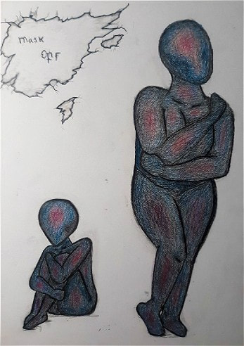
Title: Mask Off Size: _ x _ (cm) Medium: Charcoal, Colored Pencil Date of Completion: Nov. 19nd 2020
|
Exhibition Text
~~~~~~~~~~~~~~~~~~~~~~~~~ Mask Off is my vision of what a person with depression looks like on the inside, it's like the second half of 'Mask On'. From both my personal experiences, and from what I have heard from others, many people feel the need to put on a ‘happy face’ when in front of others. This drawing is what that person looks like when they take off that mask. The drawing style is inspired by ‘The Lord Provides’ by Jacob Burck, and coloring inspired by an inverted thermal image of the human body. 


|
Inspiration
~~~~~~~~~~~~~~~~~~~~~~ I took inspiration from ‘The Lord Provides’ by Jacob Burck, because when I saw his style, I liked how it was, in a way, both cartoon-esk, and realistic. I mostly took inspiration from how he shades his drawing. Especially looking at the leg and stomach of the lady in the piece. The way it was shaded looked very interesting to me. I liked how the light parts stuck out so much. I liked how the transition from dark to light was so smooth. I also liked how the anatomy of the women was realistic. She wasn't drawn as an hourglass shaped barbie. He drew the women with a realistic looking belly. I tried to draw my women as realistic as I could, with two different body shapes. However the drawing I was looking at for the model was a thin woman, and I could not quite get it as good as I would have liked. But I still wanted to put that aspect of realistic looking women in my drawing just like he did. Because not everyone has the same shape. Jacob "Jake" Burck was a Polish-born Jewish-American painter, sculptor, and award-winning editorial cartoonist. He was born on January 7, 1907, and died on May 11, 1982 (aged 75). He attended the Cleveland School of Art on a scholarship. He then moved to New York City, where he studied at the Art Students League of New York. I admire the man for how he was able to get recognized for his talent at such a young age, and was able to make a living off of it. I took inspiration from a thermal image of the human body for 'Mask On', because when I look at a thermal image, I always think about how alluring and bright it looks. I wanted to see what it would look like inverted, and after I did, I though it would be a perfect color pallet to use for 'Mask Off'. however, I did use darker colors for a more dramatic feeling. As for concept, I got my inspiration to draw the embodiment of depression, from an illustration drawn by a person from a blog. She has this blog to tell her story, she talks about her husband in the navy, and three kids, one of which has autism. She also talks about her mental issues like anxiety and depression. When I finally chose what I wanted to do, I wanted to see if anyone has done anything similar. when I saw this illustration, “The Face behind the many masks. The true face of Depression” it just struck me differently then any other illustration I saw in this topic. |
|
Planing / Process
~~~~~~~~~~~~~~~~~~~~~~~~~~~~~ When I first started this project, I had to choose between two different positive and negative duos. I was thinking of either doing an illustration of the physical and metaphorical heart, or the embodiment of happiness and depression. After I chose the second option, I went to google to see if it was done before. No one that I could see has, but there was one image that stopped me in my search. “The Face behind the many masks. The true face of Depression” by an unknown blogger. After I was that, I knew I wanted some sort of 'mask' to be in my illustration. I saw that I wanted the entire drawing to be the 'mask', and this was hoe 'Mask On' was made. For 'Mask Off' I decided to draw what my two women would look like with their mask off, hence the name. I drew up the poses in a small version, then drew them bigger. Although, just because I knew the poses I wanted, it was still difficult to draw the women with a bigger frame. I couldn't find any drawing or even real picture of a woman with the build I wanted in that pose, so I kind of used my other drawing as an example. Because for my past illustration I saw a real person in the pose, me, and it helped with the anatomy, I did that same thing in the poses for this drawing. I ended up changing the position for the girl sitting, because the pose I saw was kind of difficult to do. The pose I ended up with also just seemed more natural. I first drew it as I saw it, but in a much smaller version to see if I liked it, after that, I tried drawing in as a bigger version. |
|


After that, I needed to see how I was going to color it. When I was done with the sketches, that is when I looked up my inspiration for shading and colors. and that is exactly when the inspiration came into play. like said before, then I remembered how I used thermal images as inspiration, and how much i liked how it turned out, but of course I needed the colors to be dark, so that's when I inverted the picture to see what the colors would look like, and I really liked it, just wanted it a little darker. But the way thermal imaging looks, it still seemed too harsh, and I wanted it to look a little more smooth. That is when I saw the image by Jacob Burck. I saw how smooth his shading was, and how well looking at it helped with my last illustration, so I just looked it it again.
Lastly, I had to plan out how I was going to do the background. I liked how the sign looked in 'Mask On' but I felt like I needed to do something different, and maybe a little more chaotic. I remembered how I'v draw holes in a wall before, as well as brick walls, so I sketched some of that up. I´m not quite sure where I was going with the bricks, but after I drew the ripped wall paper, I really liked that, so that is what I went with.
Lastly, I had to plan out how I was going to do the background. I liked how the sign looked in 'Mask On' but I felt like I needed to do something different, and maybe a little more chaotic. I remembered how I'v draw holes in a wall before, as well as brick walls, so I sketched some of that up. I´m not quite sure where I was going with the bricks, but after I drew the ripped wall paper, I really liked that, so that is what I went with.
|
|
Planing / Process
~~~~~~~~~~~~~~~~~~~~~~~~~~~ The first thing that I did when I had to start drawing the final piece was to do the first layout sketch of how the body is going to look. looking at the over drawings of me doing the poses was very useful at this stage. Then I did a sketch on top of that of what the actual body would look like. Again because there weren't any bigger framed women that I could draw from as an example it was hard to get the correct look. I did a lot of trial and error, and used the eraser a lot. In the beginning of my Sketchbook I used all of my different types of pencils and did some sketches from the darkest I can go to the lightest and then erased a line through that to see what each pencil looks like from its darkest to lightest and to see which pencil looks the best for sketching and what can be raced the best. I came to the conclusion that a 2B and a 3B pencil works best for erasing. So that's what I used to do those sketches. |


After I got the first body drawn and moved on to the second one. After that was done I then finished the final sketch for the second woman. Because I already did a sketch in my notebook about how I wanted the coloring to look like I just went straight into it. Starting with black for the outlines, then a dark blue and then a brownish red color, then a light red, and then a pinkish purple. After that I went over all of the colors with the blue color I used previously but with a light hand, and did the same with the black. Again I did these two last steps very lightly. I did each section one at a time, so that I wouldn't get overwhelmed and confused with where the colors went. After I was done with the first woman I moved on to that second woman, and did the same steps
Lastly, I did the sketch for the tare in the wall. I then did the final outline, and some shading, fallowed by the 'Mask Off' in the middle.
Lastly, I did the sketch for the tare in the wall. I then did the final outline, and some shading, fallowed by the 'Mask Off' in the middle.
Reflection
~~~~~~~~~~~~~~~~~~~~~~~~~~~~~~~
Overall I really like this illustration, not only do I think that the final product came out pretty good but I also really like the message I'm putting out there. My goal for when somebody looks at my drawing is to think. I want people to think about other people and especially with an illustration like this. There's a lot of bad in this world and there's a lot of people who are very good at hiding the bad in their life with a smile or a goofy laugh. This illustration is to show what those bright and amazing people look like on the inside.
I don't think I would change anything about the message, or the drawing itself.


|
Similarities and Differences
Similarities-
- concept, the idea that some people put on a face to make others believe that everything is okay. Differences- - this illustration actually shows a woman either putting on a mask, or taking one off, mine shows my vision of what it looks like when that mask is off. - inspiration piece has no color, mine does. - her style is more of one like a comic, where as mine doesn't quite have a style I can really tie it too. |
Similarities and Differences
Similarities-
- uses similar colors. - color goes from darkest color to lightest from the outside in. Differences- - inspiration uses brighter version of the colors I used. - transition from color to color is more bold then mine is. |
Similarities and Differences
Similarities-
- soft shading. - each line has a transition that goes from dark to light. - looks both realistic, but not at the same time. - has some sort of sign that is important to the message being given from the art work. Differences- - color versus none. - his has an actual sign, my message is draw as a tare in a wall. - his message ties to issues in history, where as my message ties to mental issues. |
ACT Questions
~~~~~~~~~~~~~~~~~~~~~~~~~~~
Clearly explain how you are able to identify the cause and effect relationship between your inspiration and it's effect on your artwork.
After seeing my first inspiration piece, “The Face behind the many masks. The true face of Depression,” it gave me the full identity of my concept. I then remembered about how people were painting their bodies from a thermal image of themselves, and that gave me an idea of how I wanted to color my illustration, just inverted. Then I saw ‘The Lord Provides’ by Jacob Burck, and it showed my how I wanted to do my shading.
What is the overall approach the author has regarding the topic of your inspiration?
The women who drew the image of where I got my concept inspiration from, drew that image to show others a fraction of what it's like with a mental issue like depression, which is kind of what I am trying to do, but in a different way.
What kind of generalizations and conclusions have you discovered about people, ideas, cultures, etc. while you researched your inspiration?
After looking a little bit more into her blog, I came to the conclusion that all different types of backgrounds can have similar issues. I already knew this, but actually reading the story of someone else, along side the illustration drawn from the same person just puts it into perspective.
What is the central idea or theme around your inspirational research?
The central idea from my inspiration is that just because someone looks happy and bright from the outside, the doesn't necessarily mean that s what they are like from the inside.
What inferences did you make while reading your research?
I can infer that even the happiest of people, can actually be the saddest when they get alone.
Bibliography
~~~~~~~~~~~~~~~~~~~~~~~~~~
“Although the True ‘Labor Day’ Is May 1...” ReligiousLeftLaw.com, 2 Sept. 2013, www.religiousleftlaw.com/2013/09/although-labor-day-is-may-1.html?utm_source=feedburner.
Jacob Burck, May 2017, en.wikipedia-on-ipfs.org/wiki/Jacob_Burck.html.
Unknown. The Face behind the Many Masks. The True Face of Depression, 17 Feb. 2016, spousekidsspecialneednotinaseabag.blogspot.com/2016/02/the-face-behind-many-masks-true-face-of.html.
